February, 2013

Project 9: Future Profession Faux Stencil

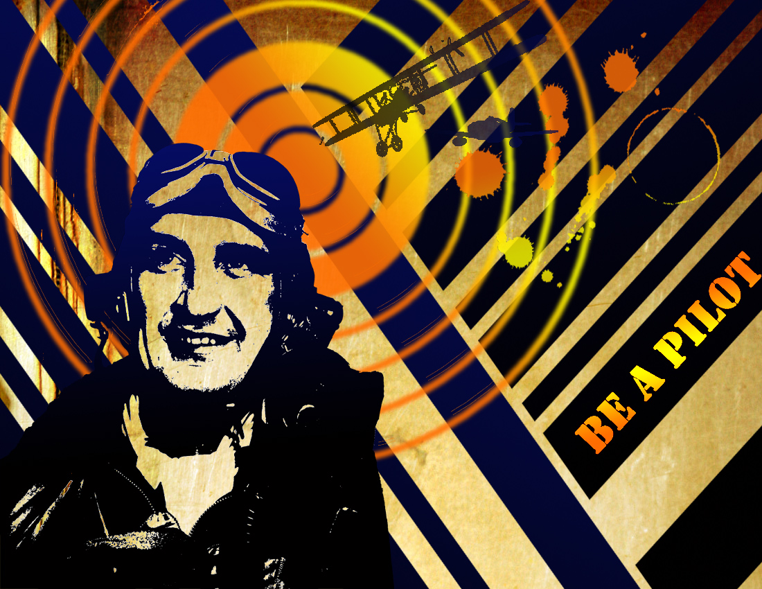
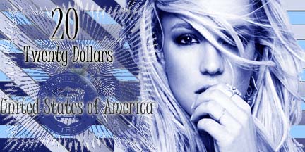
Hopefully by now you have given some thought to what you profession you might want to have when you are older.  Our next project is to create a poster advertising a profession that you are interested in.

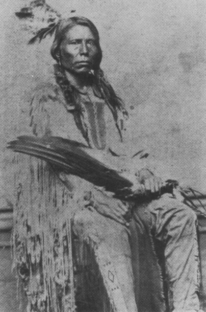
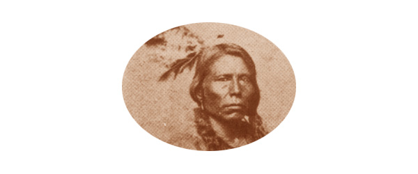
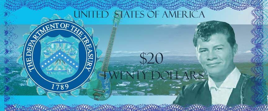
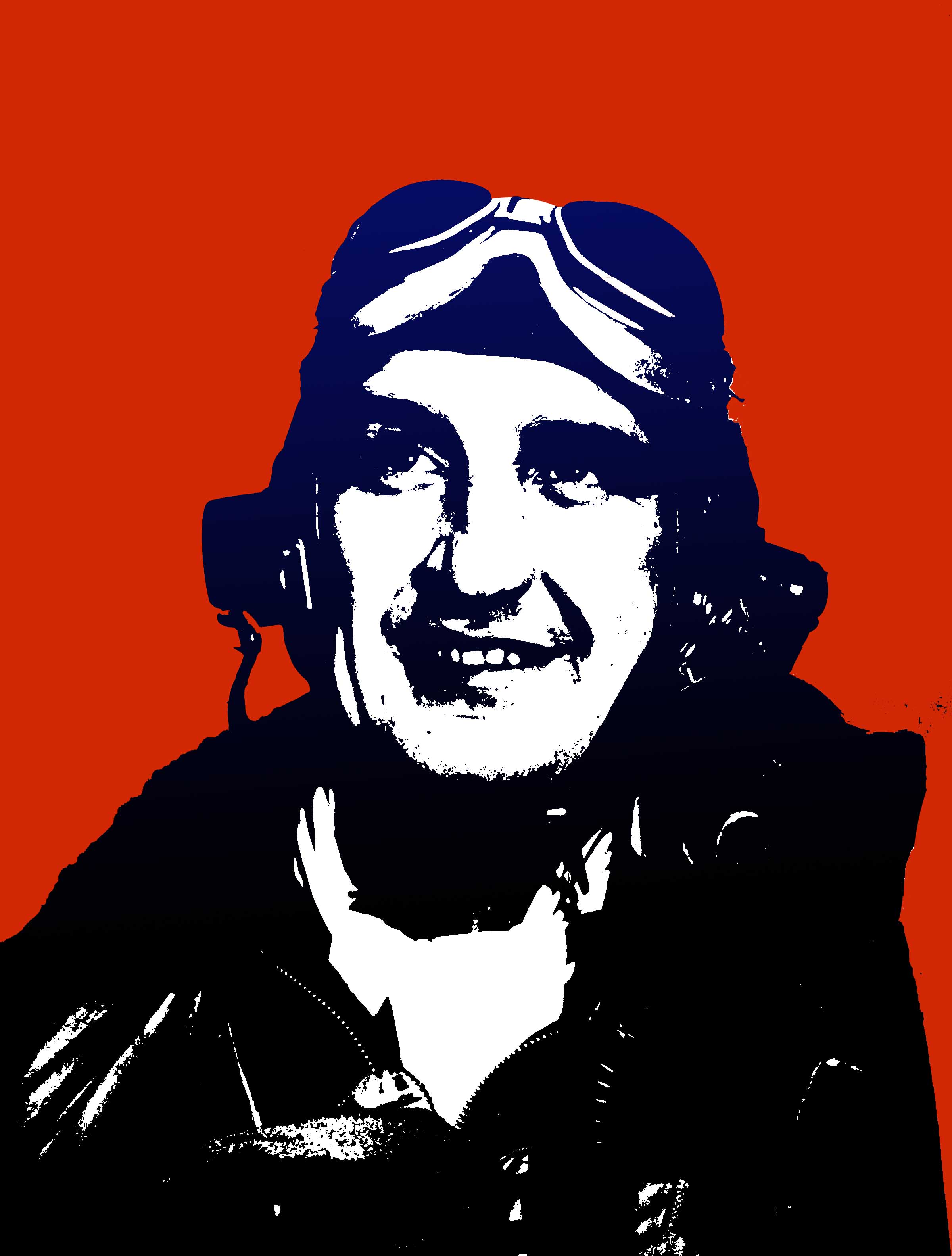
1. Begin by finding a photo of someone in your future profession.  Make sure it is big enough, our poster will be 8.5 x 11 inches again.  Delete the background of the person and adjust it under Image -> Adjust -> Threshold.  Adjust it so that you can still see the features of your person.

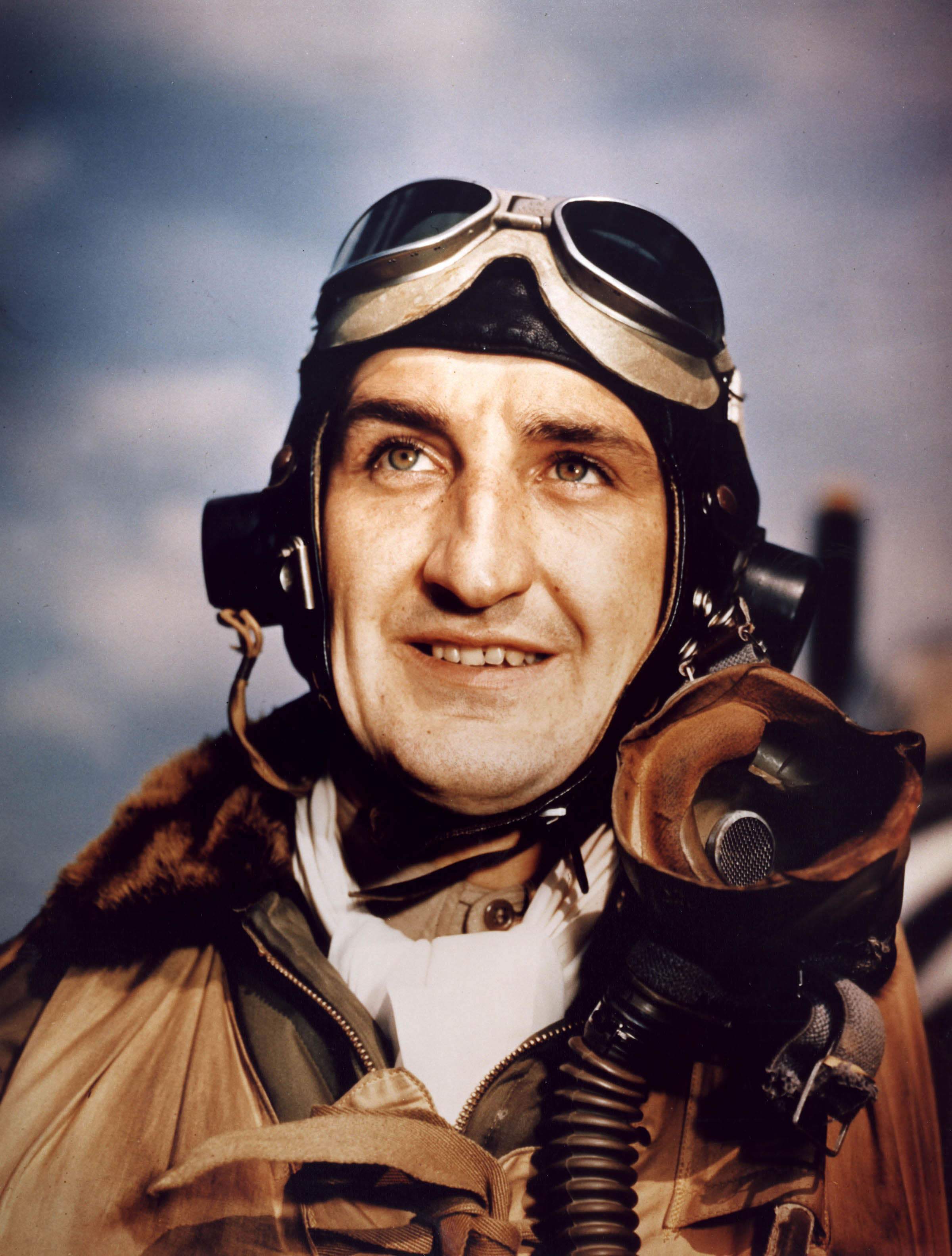
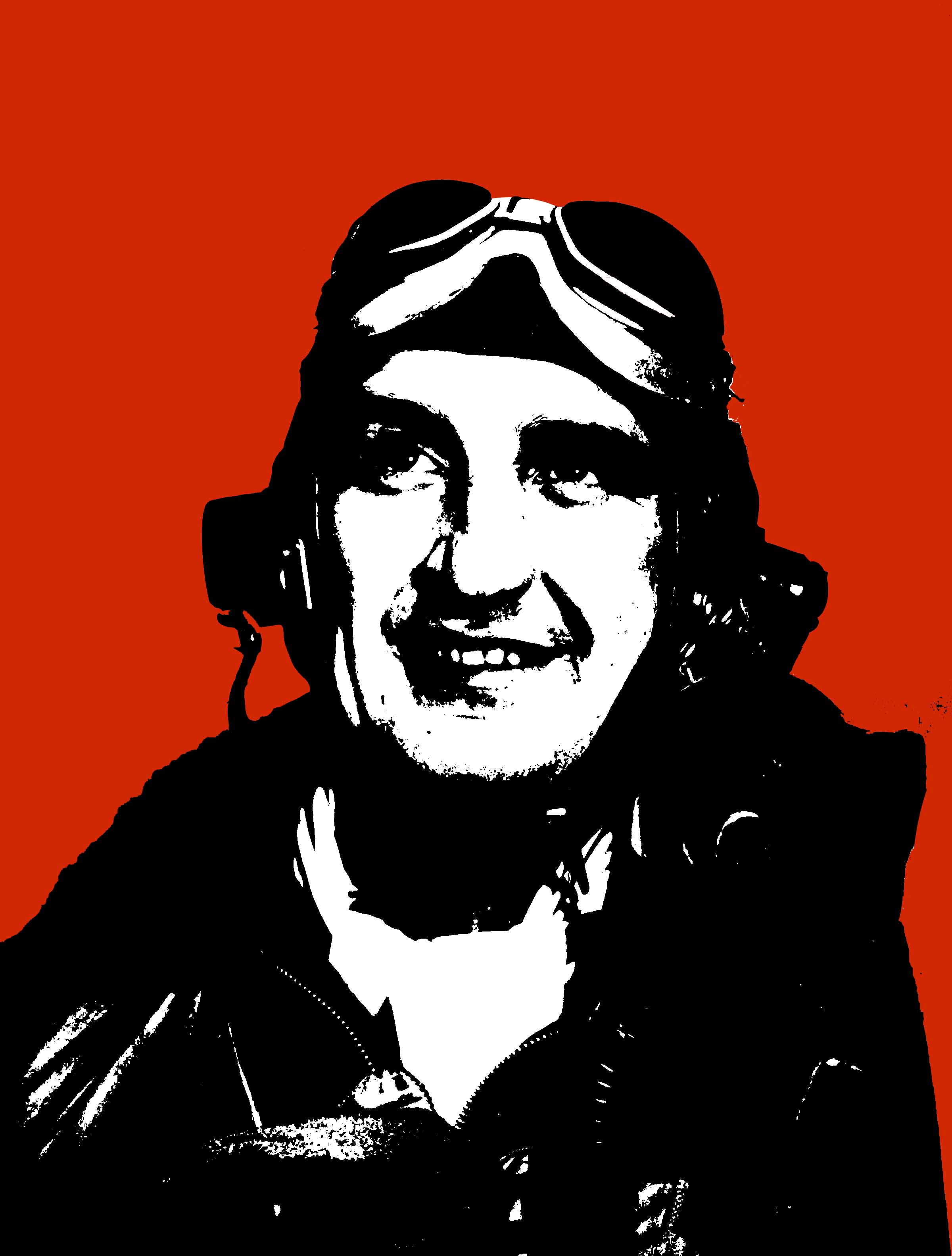
Original Photo                                           Background Deleted and Threshold Adjusted

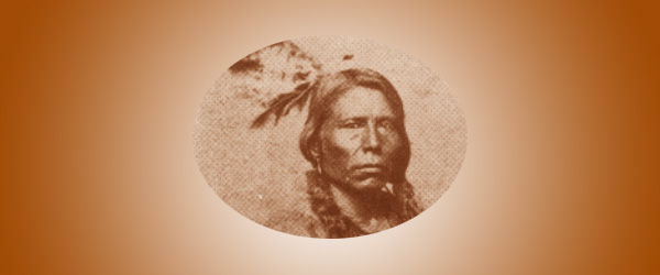
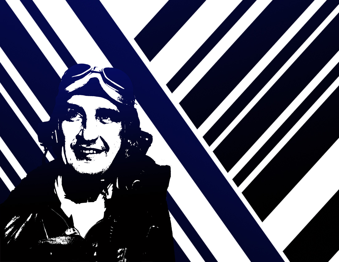
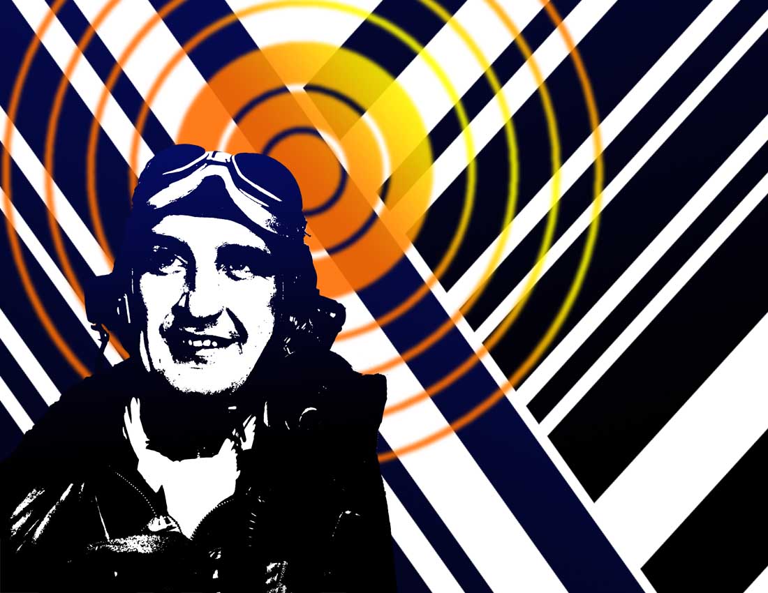
2. Next, Select all of the black in the image under Select -> Color Range.  Using the Gradient tool, make the black change to a gradient from one dark color to black.  Remember, the Foreground and Background colors are the colors that will appear in the gradient.  Save!

Black fading to Blue

3. Open a new document that is 8.5 x 11 inches.  Fill with black with the paint bucket.  Using the Rectangular Marquee tool, erase stripes.  Select the black stripes and apply a gradient that matches the gradient you applied to your figure.  Rotate the stripes to an angle.  Duplicate the stripe layer and rotate it to fill the whole poster shape.

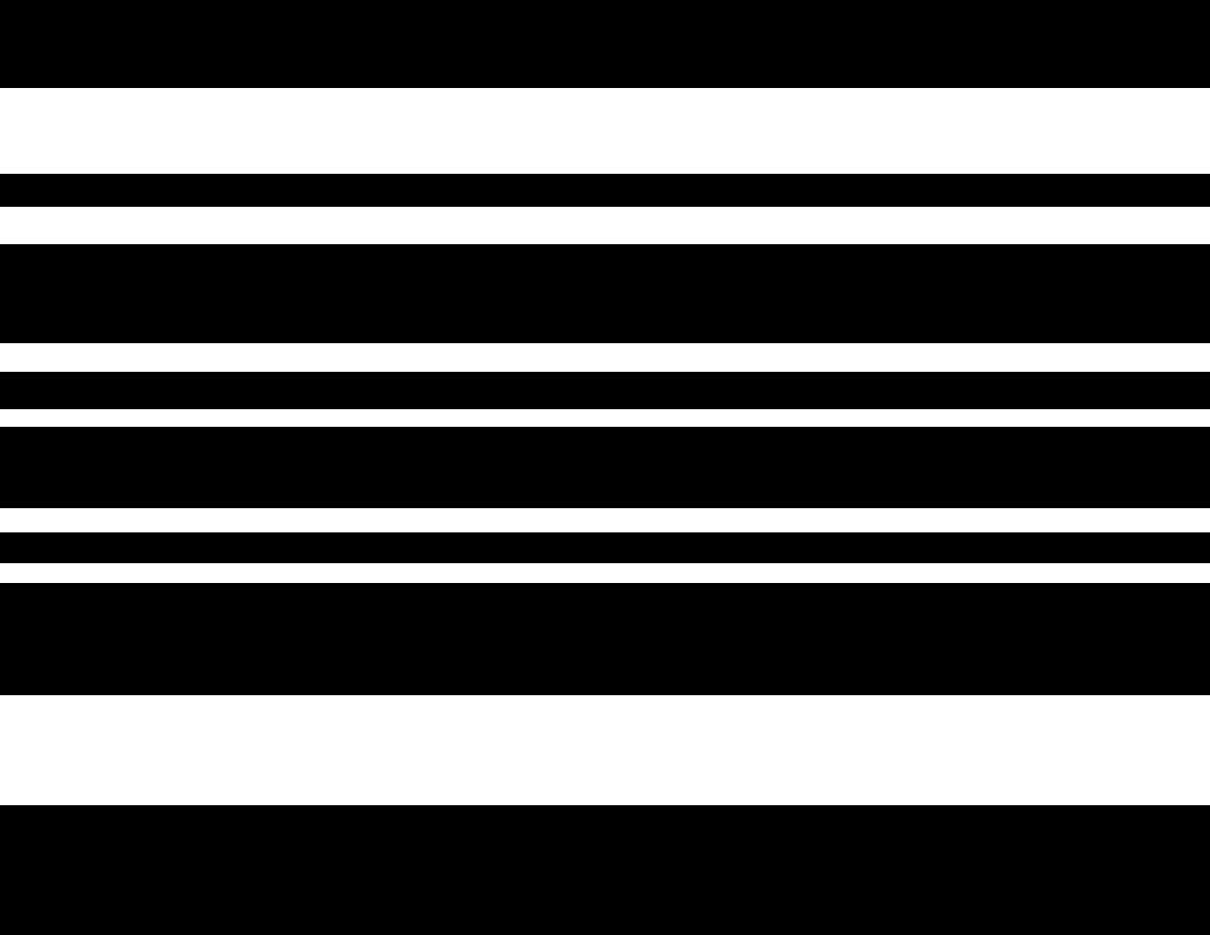
Stripes                                                Stripes rotated with gradient              2 Stripes layers

This will be the background of your poster.  If you want something other than stripes, like waves or arches, I can help you with that.

4. Paste the person onto your background.  Adjust the size and position to your liking.

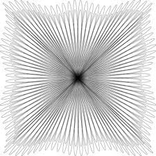
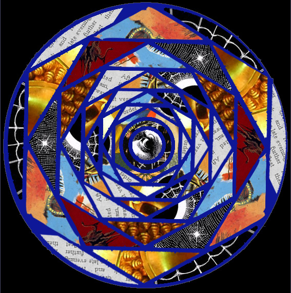
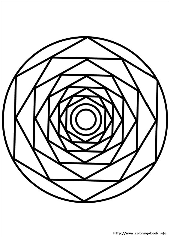
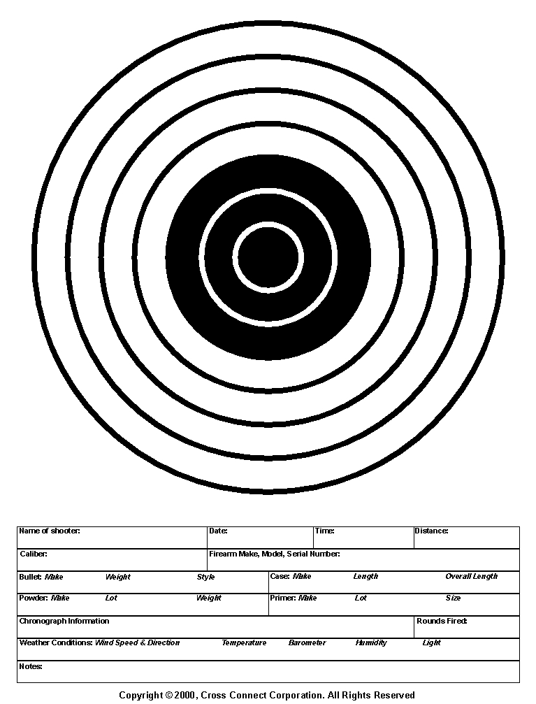
5. Search for a bulls-eye or another radial, linear shape to add to your background. Put a gradient with different colors than before.  I chose yellow and orange to stand out against the blue and black.  Paste it into your poster document, put it behind the person but in front of the stripes and adjust the opacity.

6. Erase

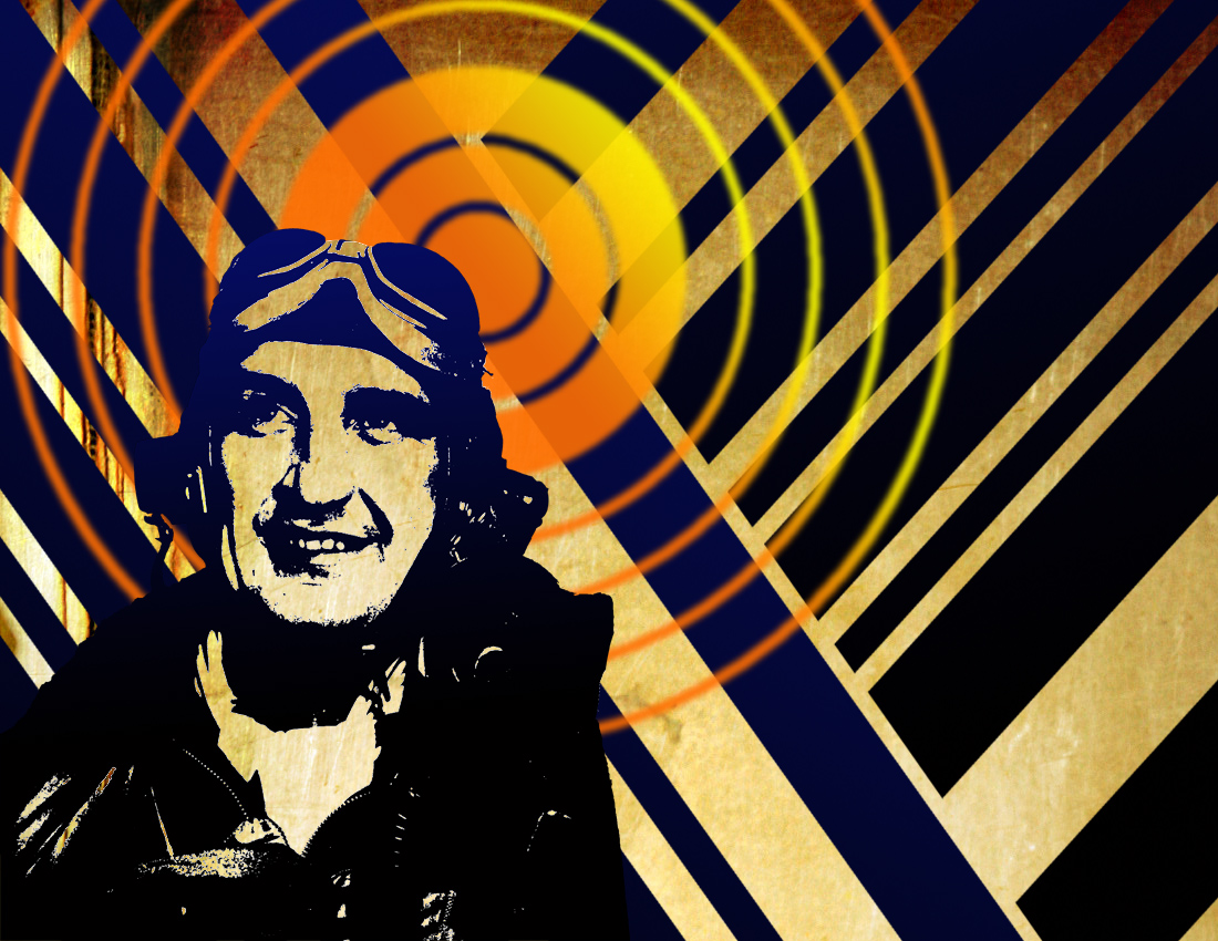
6. Erase the white in the stripes layers.  Put something else in the background as the last layer, I found old paper.  Wood, cardboard, bricks or metal would probably look cool too, just make sure its not too dark.  Select the white in the person and erase it.  You will see the stripes layers shining through.  Keep erasing this selection in the other layers until you can see your new background shining through.

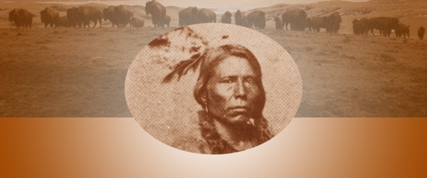
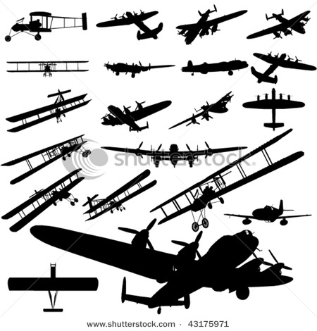
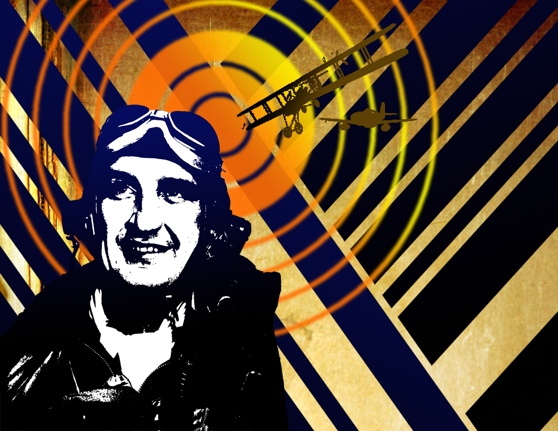
7.  Find the silouette of an object associated with your profession.  Apply a gradient to it which fits the color scheme of you poster and then add it.  Adjust the opacity.

8. Find something painterly like an ink splatter.  Apply a gradient to it which fits the color scheme of you poster and then add it.  Adjust the opacity.

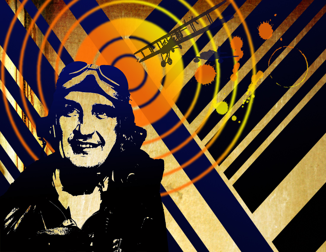
9. Add text in a Stencil-like font which advertises your future profession.  Make it a color that is not anywhere on your poster.  Rasterize/Render the text.  Make it fit into your composition by transforming it and rotating, skewing it etc.  Select the color and then apply a gradient which fits in with your color scheme.

10.  Breathe, you’ve finished and it looks awesome! (I hope).  Post it to your blog under Project 5 and write a little something about the experience of creating it.

Seward’s Choice

Project 8: New Money

Most countries of the world have developed their own form of paper currency, or bills.  Here are some examples:

Some people say that, in comparison the United States has boring currency.  What do you think?

I came upon a website challenging Americans to design new bills, which I thought was a fun idea.  Here are some of the designs people came up with:

You are going to design a new bill.  But first, you need to decide:

Who/what would you put on the a bill to represent the US, and why?  You will need to explain your reasons when you post your design.  First, brainstorm.  What ideas does the US stand for?  Life, liberty, and the pursuit of happiness Ingenuity?  Innovation? Integrity?  Entrepreneurship?  Equality?  Arts?  Strength? What should our country stand for?  Who/What would represent these ideas?

I chose Crazy Horse as my person because he nobly fought for the rights of his people when he felt that they were being treated unfairly by the US government.

1. Decide on the dimensions of your bills.  Are they rectangles/squares/horizontal/vertical?  Open a new Photoshop document in that shape.  Don’t make it too huge, it has to fit in your wallet!

2. You could  cut a circle around your person/animal/thing or delete the entire background.  Look back at the examples.  I cut an oval shape around Crazy Horse using the Circle Marquee Tool.

2.  Stylize your person/animal/thing somehow.  Suggestions: Anything under Image->Adjust or any Filter.  I did Image->Adjust->Color Balance to make Sitting Bull a brownish color.

3. Add a general background to your bill to match the person/animal/thing.  I chose a gradient in brown and white:

4. Add some other sort of background element, perhaps a place associated with your person/animal/thing?  I chose a photo of the Lakota Reservation with buffalo, another American symbol.  Adjust the opacity so it fades into the background some and colors to match.

5. A lot of money has lacy floral type patterns called guilloche rosettes. Here are some I found but feel free to find your own:

Incorporate one or more of these into your design.  Remember, you can always change the color!

6. There needs to be some information on your bill.  Remember, the type is a part of your design, make it look cool!

Amount – both numerically and in English (5, Five Dollars)

CountryUnited States of America

7.  In order for this money to be official, we need the Seal of the US Department of the Treasury. It is used on all U.S. paper currency, and (like other departmental seals) on official Treasury documents. The seal includes a chevron with thirteen stars, representing the original thirteen states. Above the chevron is a balance, representing justice. The key below the chevron represents authority and trust.

Remember, you can (and should) change the seal to match your design!  I adjusted mine using Image->Adjust->Threshold, deleted the white, selected the black, and then gave it a purple-brown gradient.

8. Flatten image and post it to your blog.  Explain why you chose the person/animal/place that you did to represent the US.  What tools did you use in this project?  Did you learn anything new? I can’t wait to see what you come up with.


Student Examples from last semester:


Project 7: Mandala

What is a mandala?

A mandala is a geometric pattern or chart, typically circular or square, that symbolically represents the cosmos and is used for meditation purposes. The mandala originated in the Hindu religion, in which it was first used as a design element in temples, and was borrowed into Buddhism. Other religions and cultures have analogous meditation aids, and in an expanded sense, a mandala may even be a round, symmetrical building used for worship.

Creating a mandala can be a form of meditation, as well as contemplating a finished mandala. In Tibetan Buddhism, there are strict guidelines concerning the content and design of a mandala, including the visualization of the piece and mantras to be recited as it is made. Different types of mandalas are used to represent different elements of Buddhist beliefs and cosmology, but they are generally full of symbolism and richly detailed.

Tibetan Buddhists also make sand mandalas, using delicate tools and colored sand to create intricate designs. After they are made and contemplated according to ceremony, sand mandalas are destroyed, symbolizing the impermanence of everything. Every element of the sand mandala, from marking out the pattern, to pouring the sand, to disposing of the used sand, is ritualized. Mandalas also appear in Japanese Buddhist temples and rituals, although the sand mandala is unique to Tibetan Vajrayana or Tantric Buddhism. Meditation or prayer aids in other religious traditions, such as the rosary of Catholicism, are considered by some to be a type of mandala. (from WiseGEEK.com)

We are going to make our own mandalas using photos.

1. Choose a mandala template.

2. Open the template in Photoshop and delete the white so that it’s transparent other than the black lines.

3. Add your first photo as another layer and put it behind the mandala template.  Choose your photos based on texture and color.

4. Pick one shape within the mandala template to focus on.  Move the photo layer until you like the section which is behind your mandala shape.  You can rotate it or adjust the scale if you’d like.

5. On the mandala template layer, use the magic wand tool to select inside the shape.  Click Inverse Selection.  Go to the photo layer and press delete.  You should now have just a portion of the photo inside the mandala shape, like the photo below.

6. Continue this process until you have a vertical row filled.

7. Unclick the eyeballs on all of the layers except the new shape layers you have made.  Click Layers->Merge Visible. Now all of your shapes are on one layer.

8. Duplicate this layer and rotate it to fit other sections in a pattern.

9. Continue with this process until the whole mandala is filled!  My only rule is that shapes from the same photo should not touch.  If you want, at the end, get rid of the mandala template layer and add a new background color.  Have fun, be creative and make something that looks cool!

10.  When you are done, post it to your blog under Project 9:Mandala, and write about how the project went, if you learned anything,etc.

Here are some past examples from SHS students:

Audra Atwood

Michael Marshall

Project 6: Seward’s Choice Logo

Make a difference, Make a bag

Background information

While plastics are certainly useful to our society, the truth is that our current usage is not sustainable. Did you know that plastic is made from oil?  Plastic takes oil and energy to make, and also is disposable, meaning it fills landfills and ends up as litter in our land and oceans. We don’t know how long it takes plastic to break down – if ever. It hasn’t been in existence for long enough for us to prove whether or not it ever goes away. As far as we can tell, it breaks down into smaller and smaller pieces, but never truly biodegrades.

Plastic bags especially pose a threat to marine animals who can ingest them or become entangled in them.  Sea birds, mamals, and fish all can become ill or die from coming into contact with plastic bags.  Plastic debris in the ocean can interfere with commercial and recreational fishing, and its also just ugly!

Paris, Mexico City, Bangladesh, Ireland, South Africa, Rwanda, Taiwan, and China all either tax or completely ban plastic bags.

82 communities in the US have banned plastic bag bans.  Half of them are in California.  Half of these bans were instilled in 2012.  Homer, AK has just banned plastic bags as well.

There is a new organization in Seward, which is hoping to reduce the amount of single used disposable plastic items, in particular plastic bags, that we use.

One of this movements goal is: to encourage people to choose reusable bags instead of plastic bags. They are planning on several events where people of all ages can make their own permanent reusable shopping bag which they can use in lieu of plastic. These events will be called “Make a Difference – Make a Bag”.

The momentary name of this group is: Seward´s Choice
Feel free to suggest an even better name! 

They have asked for help with a logo to go with the organization.  Youre next assignment is to create a logo using only 2 colors.

Ideas you need to convey:

this is positive

this is environmental

this has to do with plastic and bags

this is volunatary

this is local (Seward related)

Visual Ideas:

Most volunteer logos seem to use outstretched hands, can you think of another way to show this idea?

here’s a cool anti-plastic bag design

here are some basic “green” logos

how could you tweak these ideas to represent Seward’s Choice’s message?

Mount Marathon Design