Project 6: Seward’s Choice Logo

Make a difference, Make a bag

Background information

While plastics are certainly useful to our society, the truth is that our current usage is not sustainable. Did you know that plastic is made from oil?  Plastic takes oil and energy to make, and also is disposable, meaning it fills landfills and ends up as litter in our land and oceans. We don’t know how long it takes plastic to break down – if ever. It hasn’t been in existence for long enough for us to prove whether or not it ever goes away. As far as we can tell, it breaks down into smaller and smaller pieces, but never truly biodegrades.

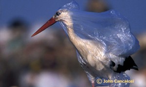
Plastic bags especially pose a threat to marine animals who can ingest them or become entangled in them.  Sea birds, mamals, and fish all can become ill or die from coming into contact with plastic bags.  Plastic debris in the ocean can interfere with commercial and recreational fishing, and its also just ugly!

Paris, Mexico City, Bangladesh, Ireland, South Africa, Rwanda, Taiwan, and China all either tax or completely ban plastic bags.

82 communities in the US have banned plastic bag bans.  Half of them are in California.  Half of these bans were instilled in 2012.  Homer, AK has just banned plastic bags as well.

There is a new organization in Seward, which is hoping to reduce the amount of single used disposable plastic items, in particular plastic bags, that we use.

One of this movements goal is: to encourage people to choose reusable bags instead of plastic bags. They are planning on several events where people of all ages can make their own permanent reusable shopping bag which they can use in lieu of plastic. These events will be called “Make a Difference – Make a Bag”.

The momentary name of this group is: Seward´s Choice
Feel free to suggest an even better name! 

They have asked for help with a logo to go with the organization.  Youre next assignment is to create a logo using only 2 colors.

Ideas you need to convey:

this is positive

this is environmental

this has to do with plastic and bags

this is volunatary

this is local (Seward related)

Visual Ideas:

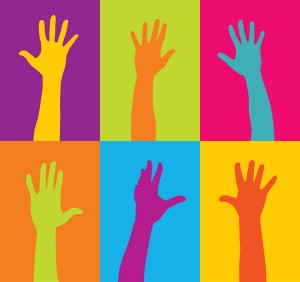
Most volunteer logos seem to use outstretched hands, can you think of another way to show this idea?

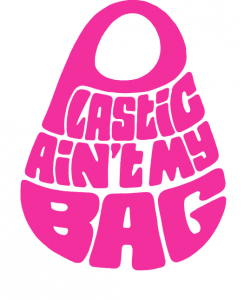
here’s a cool anti-plastic bag design

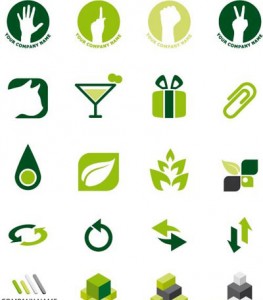
here are some basic “green” logos

how could you tweak these ideas to represent Seward’s Choice’s message?

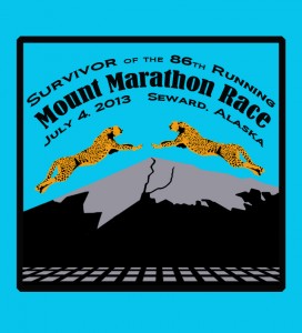
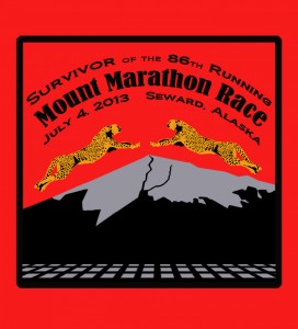
Mount Marathon Design

Project 5: Silver Salmon Derby

New Call for Art from the Community!  $200 Prize, Fame, Glory: The chosen design may be reproduced on t-shirts, sweatshirts, hats, pins, and/or poster.

DESIGN THE LOGO FOR:

2013 Seward Silver Salmon Derby

 Their Rules:

The design must include:

  • Seward Silver Salmon Derby
  • August 10 – 18, 2013
  • 59th Annual
  • Seward, Alaska
  • Prefer a salmon or fishing design

Design must fit on 8 1/2 x 11 inch paper and have four color maximum.

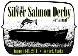
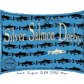
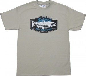
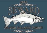
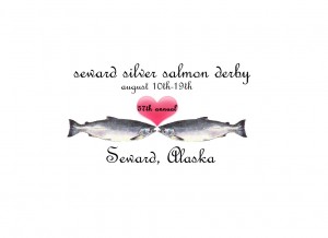
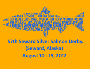
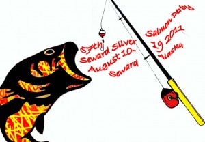
My Thoughts:  Be creative and think outside of the box!  Here are the last 4 years designs:

2103

2013

2012

2011

2010

2010

2011 and 2010 look almost the same!  How could you create a silver salmon in a different way, different angle, etc?  Apply the skills you learned when working on other projects.  Good luck and make something cool…win that money!

Here are some designs from students last year:

Audra Atwood

Gabe Esposito

Kiana Clemens

Project Four: Mount Marathon Logo

Here is some more real world graphic design.  Also due Jan 31, 2013!:

The Seward City of Commerce is looking for a logo for the 2013 Mount Marathon Race.

Here are the rules:

size 8 1/2 x 11 inches

Only 4 colors

Include:

Mount Marathon Race

July 4 2013

86th Running

Seward, Alaska

The word “finisher” or “survivor”

Must have a mountain theme

We will actually enter these and the winner recieves $200!  The chosen design will be made into T-shirts, hoodies, hats, patches, and posters.  Keep in mind that the patches will be round.

Michael Marshall won this with the design he came up last year.


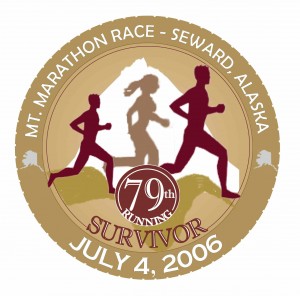
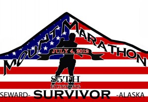
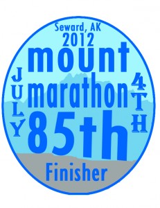
Here are some other cool designs from last year:

Gabe Esposito

Jacob Sears

My Rules:

Include a mountain and something to represent running.  Remember, good logos are bold and get the point across clearly.  The point of this logo is a hardcore race up a mountain in Seward, Alaska.  How can you represent these things visually?  Remember, the text is a part of the art, incorporate it into the design, not just as an afterthought.  You know how to add effects, bend it, etc.

I can’t wait to see what you come up with!  Use the knowledge you have learned from your other projects, you are becoming Photoshop masters

* Remember to use royalty free images or to create your own!

Here are other logos for inspiration:

Project 4: Concert Poster

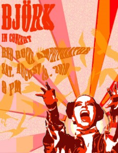
Concert Posters are works of art.  Check out examples on Google Images.  You will create a poster for a band or artist advertising the event of a concert.

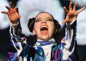
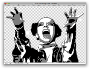
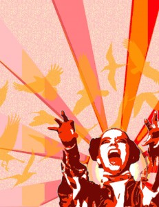
1. Pick your artist/band.  Find a good, dramatic photo of them and make sure its not too small.  Open it up in Photoshop and get rid of the background.   Make it black and white under Image–>Adjust–>Desaturate.  Blur it a little under Filter–>Blur–>Gaussian Blur.  Posterize it under Image–>Adjust–>Posterize (3-4 Levels).  SAVE!

From this                                                                                    To this

2. Find two large vector graphics to combine to make your background. Vector graphics is the use of geometrical primitives such as points, lines, curves, and shapes or polygon(s), which are all based on mathematical equations, to represent images in computer graphics.  Look at these links: vector wallpaper, vector backgroundsgeometric designfree vectorsvector ray or find your own.  I chose to use these two:

3.  Open a new document in Photoshop that is 8 1/2 inches wide by 11 inches tall.  Paste one of your vector backgrounds into this document and rotate, move it until you like the composition.  If your background has a lot of detail, posterize it under Image–>Adjust–>Posterize (3-4 Levels).  If you don’t like the colors, change them under  Image–>Adjust–>Hue/Saturation.

My 8 1/2 x 11″ posterized vector background

4. Paste the image of your artist/band onto your background.  You need a color scheme to tie the poster together.  I chose to make my poster in all warm shades like red, orange and yellow.  Click Select–>Color Range and then click on a black part of your artist/band.  Choose a dark color in your color scheme and then click Edit–>Fill–>Foreground Color.  The black should now be the new color.  Repeat this step with the shades of grey in your artist/band.  Your artist/band should now match your background.

5. Paste your second vector image into the document.  Make it the middle layer.  Posterize it, and change the colors to match the color scheme.  Adjust the opacity level so that you can see through it to the back layer.

6. Now you need to create the text for your poster.  The poster should include the name of the artist/group, the venue (place) they are playing at, the date and time and if you choose, the opening band.  Pick a cool font and colors to match your color scheme.  Next, distort your text in some way.  First – Photoshop 5.5: Render the type layers under Layer–> Type–> Render.   Photoshop 6.0 Rasterize the type layers by right clicking on it and selecting Rasterize.  Now you can change the text in different ways.  You could click Edit–>Transform–>Skew, Distort, or Perspective.  Another option is to click Filter–>Distort and try out the different options.  Make sure your text is somewhat legible!

7. Phew!  Once you are finished, flatten image and save as a jpeg.  Post your poster to your blog.  What new did you learn how to do on photoshop with this assignment?  What do you think of your product?

Project 3: Regional Basketball T-Shirt Design!

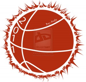
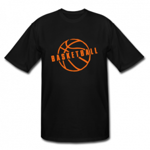
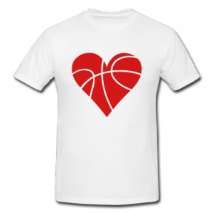
Ms. King wants a Tshirt designed for the South Central Basketball Conference held here at SHS.  She needs the design by Jan 31 !!  This is real life graphic design.

Rules:

2 colors maximum (a printing cost issue)

Size: Kind of up to you the exact dimensions but I would guess around 6″ x 6″ or so.

Text:

South Central Conference Tournament

Teams:

Seward (seahawks), Nikiski (bulldogs), Skyview (panthers), Homer (mariners), Grace (grizzlys), ACS (lions), Houston (hawks), Cordova (wolverines)

* You can include the team mascot or not, up to you.

 The shirts are Grey and Black.  Make one T Shirt Design but turn in two versions, adjusting the colors so that they look good on both a Black and Grey background.

You can make a design for the front and the back or just the back, up to you.  However, the title, an image and all the team names might be a lot to fit on the front of the shirt.

Main Ideas: A basketball tournament of teams from South Central Alaska.  How can you convey this visually?

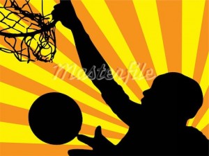
Image ideas: Basketball, Alaska flag or map, net, court, player silhouette

 You cannot just steal someone elses image!  You must change it significantly otherwize its a copyright infringement.  All of these images are royalty free

Stock Basketball Photos 2

Stock Basketball Photos 3

You can choose something simple or make an image more simple (2 colors) with image, adjustments

Remember the text is a part of the image!  Make it look cool and legible.

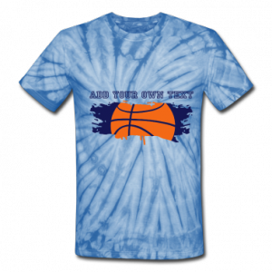
Here are some ideas from the Internet:


Assignment 8: Text

1. Drop Shadow – Manual
Drop Shadow

  1. Open a new document and type some text about 72 points.  Chose a thick font!
  2. Duplicate the type layer.
  3. Change the text color on the bottom layer to black.
  4. Move the black text layer several pixels down and to the right.
  5. Apply Filter > Blur > Gaussian with a radius of about 2-5 pixels depending on the type size.
  6. Adjust the opacity of the shadow layer as desired.
  7. Add some sort of background to your text.
  8. Flatten image and save as a jpeg under drop shadow.

2. 3D Text – Manual
3D Raised Text3D Emboss Text

  1. Open a new document ( 6 x 4″) and type some text about 72-100 points.  Chose a thick font!
  2. Duplicate the type layer twice. You should have three identical layers.
  3. Move the bottom-most layer two pixels up and two pixels left and change the type color to white.
  4. Move the middle layer two pixels down and two pixels right and change the type color to black.
  5. Fill the background with the same color as the topmost type layer.
  6. Flatten image and save as a jpeg under 3d.

3. Perspective Shadow
Perspective Shadow

  1. Open a new document and type some text about 72 points.  Chose a thick font!
  2. Duplicate the type layer.
  3. Change the text color on the bottom layer to black.
  4. Skew the bottom layer to the right so it looks like a shadow on the ground.  Photoshop 5.5 &6.0 Edit–>Transform–>Skew Photoshop Elements Image–>Transform–>Skew
  5. Photoshop 5.5: Render the black type layer under Layer–> Type–> Render.   Photoshop 6.0 Rasterize the black type layer by right clicking on it and selecting Rasterize.  Photoshop 8.0 right click the black type layer by right clicking it and selecting simplify layer.
  6. Select the gradient tool and set the options for black to white.
  7. Hold the Ctrl key and click on the black type layer
  8. Click once at the baseline of the type, then hold the shift key down and click again at the tallest point of the shadow layer.
  9. Bump the shadow layer up one pixel.
  10. Add some sort of background to your text.
  11. Flatten image and save as a jpeg under Perspective Shadow.

4. Motion Text
Motion Text

  1. Open a new document and type some text about 72 points. Italics work well.
  2. Duplicate the type layer.
  3. Render/Rasterize the bottom layer.
  4. Filter –> Stylize –> Wind: Method-Wind, From the Left
  5. Move the Wind layer a few pixels left.
  6. Filter –> Blur –> Motion Blur: Angle-0, Distance 10-15 pixels.
  7. Adjust the position of the blurred layer again if necessary.
  8. Reduce the opacity of the blurred layer to about 60-80%.
  9. Add some sort of background to your text.
  10. Flatten image and save as a jpeg under Motion.

Project 2: Hybrid Animal AD

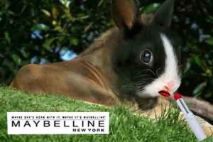
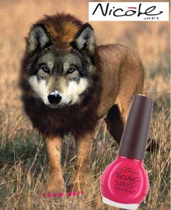
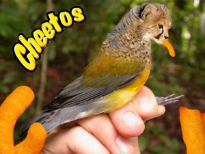
There are many hybrid animals in mythology, that is creatures that are a combination of  two or more animals.  One common hybrid is a mermaid (part woman, part fish).  What hybrids can you think of?  Here is a list from Wikipidia.

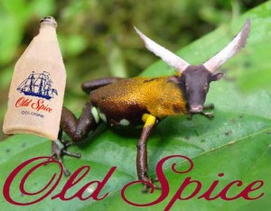
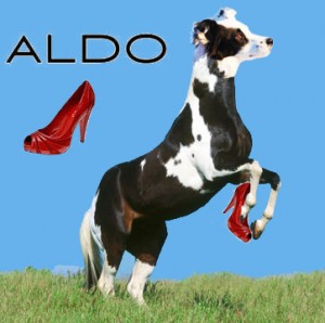
I want you to create your own hybrid using Photoshop, and have that hybrid advertize some product.  In my example, I made a Dog/Horse which is advertising Aldo shoes.  You may choose which animals to combine, and which product to endorse.  You will isolate different parts with the magnetic lasso tools.  Make your two creatures join as seamlessly as possible by adjusting the different parts to the right size, angle, color.  The clone tool can be useful as well for making fur/scales to cover where two parts are joining!  Good luck and have fun.

Assignment Seven: Clone Stamp Tool

Clone Stamp Tool

I want for you to practice with the clone tool, which is very useful.  Using this tool, you can copy a portion of an image and reapply it repeatedly to cover an unwanted portion of the image.

Hold down Alt to choose the area to clone, click.

In a new layer, clone the sample that you took and paint it over a part you want to cover.

Using the clone tool, you will open up the following pictures and modify them.

 
1.  Remove the cruise ship from this photo: Cruise Ship
 
2. Remove the bottom blue angel airplane and replace it with the sky & clouds background. Make sure that you use the correct background sample (use sky if the plane is in the sky, and clouds if it is surrounded by clouds). Blue Angels 
 
3. Remove the ship on the right. There are people in the water also, and they should be replaced by water. Pirate Ship Save all three pictures as jpegs and post themto your blog under the title Assignment Seven.

Write about your experience with the Clone Stamp ToolWhat does it do? What could you use it for?

Project One: Pop Art

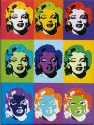
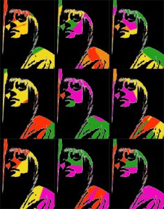
Repetition can be a good thing in art.  Now that you know how to move, manipulate and add different layers, as well as make selections with different tools you are ready for your first project.

1.Decide what image you want to repeat, a person, animal, object, plant…whatever.  This image should be a photograph, no cartoons or computer graphics.  Save the jpeg image and open it in photoshop.

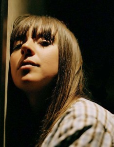
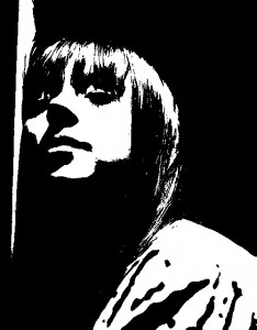
I chose Cat Power

2. Adjust the threshold of your image.

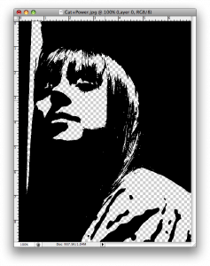
3. Under Select–>Color Range, click on a white part of the image.  All of the white in the image should now be selected.  Delete it.  You should now see a checkered pattern where there was white.  This means it is transparentSelect all of the image and copy it.

4. Open a new blank document in photoshop.  You can pick the dimentions in inches.  Make them add up to around 10, ie 4 x 6 inches more or less. 

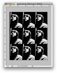
5. Paste your image into this new document.  Shrink it under Edit–>Transform–>Scale.  Copy it again and make at least 9 total.  Arrange them in a pleasing way, doesn’t have to be a grid like mine.

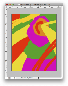
6. Add a new layer behind your pattern.  Using the paintbrush tool, paint some design with bright colors (at least 4).  Here is mine.

Here they are together.  Pop Art!

7. Flatten your image, save it as a JPEG and post it onto your blog under Project One: Pop art.  Write about your first experience actually making art with photoshop.  What was easy/difficult/annoying/awesome?  Do you like your product?

« Previous PageNext Page »